Authors: Gabriel Lindelöf, Talayeh Aledavood and Barbara Keller
Interactive plots
Following the bold links bellow you will find interactive plots where you can explore the topics of the paper interactively.
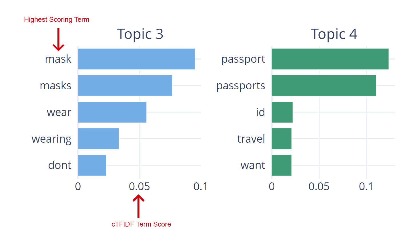
Topic Representations shows the most impotant keywords of each topic’s representation, calculated using BERTopics cTFIDF method. You can read more about cTFIDF here. Click here to go to the interactive graph.
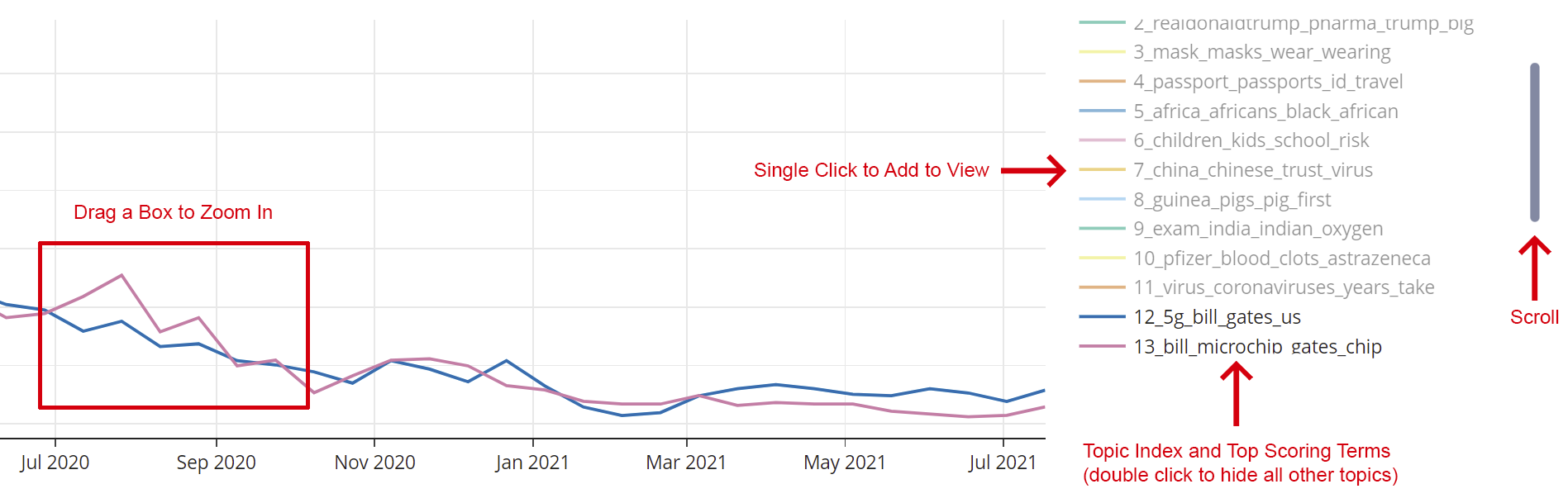
Topics Over Time shows the popularity of each topic over time, often refered to as a Dynamic Topic Model. All topics are shown by default which can be messy - double click on a topic’s name to deselect all other topics. Topics can then be added one by one for comparisons. To allow for easier comparisons between topics of different size the frequencies have been normalized to values between 0 and 1. A topic having a higher peak than another in the graphs should therefore not be interpreted as it being more popular, but rather as relative popularity for that particular topic.
The Dendrogram shows how close the topics are to each other, illustrated as a hierarchy.
Intertopic Distance is another way to view the distance between topics, projected on a plane. Drag a box around a cluster to zoom in.
Dataset
Our annotated dataset used to train the classifyer to detect the stance of tweets towards COVID-19 vaccines is available at our GitHub page
Contact
For any questions contact gabriel.lindelof@aalto.fi or barbara.keller@aalto.fi